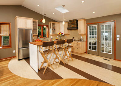
One of the first and most important things to consider in a kitchen design is the layout. This focus on functionality ensures that the kitchen is not only aesthetically pleasing, but also convenient for everyday use. In the Upper Marlboro kitchen, we wanted to maintain roughly the same layout as the existing kitchen, with the sink underneath the window, and an island in the center.
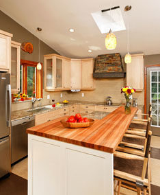
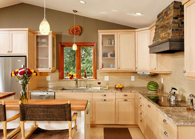
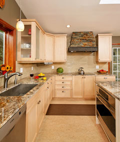
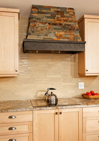
In an effort to open up the space adjacent to the patio door, we moved the fridge to the other end of the kitchen. The old electric range had been in the island, however, this design did not provide adequate ventilation. Therefore, our design called for an induction cook-top in the counter closest to the door, with a chimney hood (vented to the outside) tapering up to the ceiling. The hood, with its mitered stone tile and rough-sawn oak trim not only provides sufficient ventilation, but is also one of the key design features of the kitchen. To conserve counter and upper cabinet space, we built a microwave into the island, next to the oven.
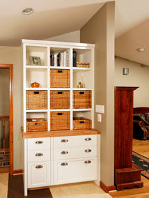
To update the cabinetry, our design called for shaker-style doors in a natural maple finish along the walls, with contrasting white cabinetry for the island and desk area. The frosted glass doors on either side of the window help give the kitchen an open and contemporary feel.
One of the foremost design challenges in houses with an open floor plan, is to separate the different living spaces without adding walls or other barriers such as folding screens. In this particular home, we achieved this with the flooring. Our design called for a striped Marmoleum material (which is both durable and comfortable to stand on) to transition seamlessly with the existing hardwood in a sweeping curve. While the installation process was both tricky and time consuming, our design team was confident that the extra effort would be well worth it.
For the main countertops, we chose a granite with a beautiful swirling pattern that fit with the color scheme of the kitchen. The raised L-shaped bar in the island is a hardwood (Lyptus) butcher-block that contrasts nicely with the granite, and ties the new kitchen together with the oak floor in the rest of the house. The finishing touch was the backsplash, for which we selected a neutral glass tile that compliments the kitchen color scheme nicely.
Take a look at the pictures below and let us know what you think about this beautiful kitchen design and remodel!
