Kitchen and Bath Remodel in Chevy Chase, Maryland
Project Overview
The clients came to Four Brothers to remodel the kitchen and bathroom of their mid-century home in Chevy Chase. They had a particular affinity for mid-century modern furniture, fixtures, and art, and wanted their renovation to harmonize with the architecture and style of their 1940’s home. Using a palette of bright blue, greens, and a lot of teak, we achieved three brand new spaces with a “vintage-inspired modern” aesthetic.
Design and Layout
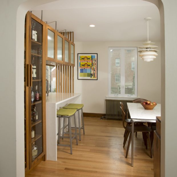
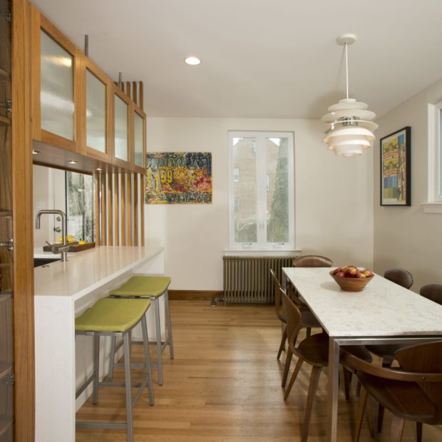
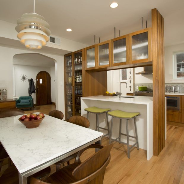
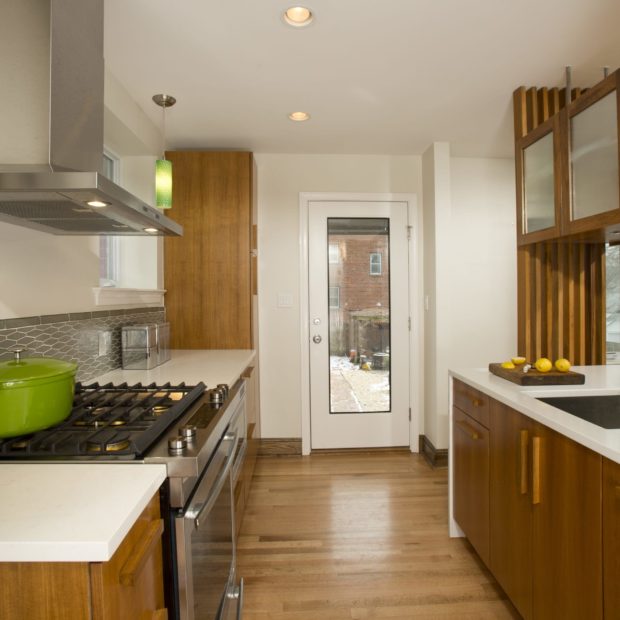
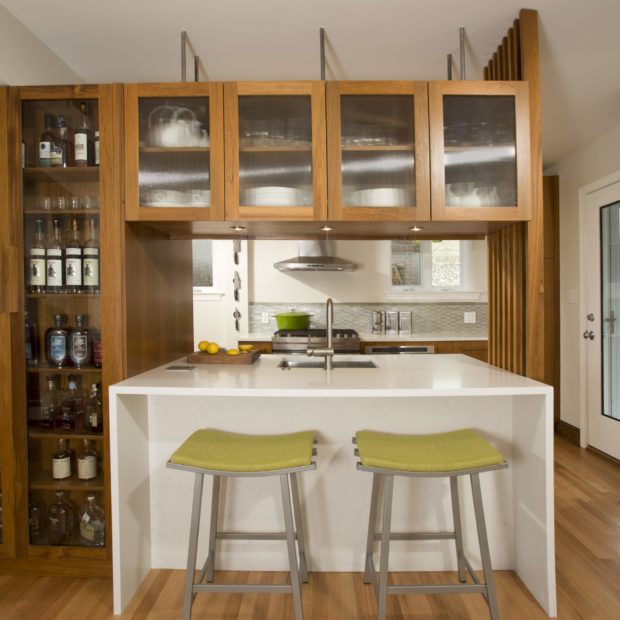
The existing galley kitchen was small with limited storage and awkward counter configurations. A previous renovation updated the cabinetry, but failed to accommodate the needs of a heavily used kitchen. More space was a definite must-have! The clients also enjoyed entertaining from time-to-time and often found themselves partitioned from their guests while preparing meals and drinks. The plan was to remove a non-load-bearing wall to push the kitchen into the dining room and create seating at a new island. As members of the craft-cocktail community, the homeowners boasted quite a collection of liquors and bitters. They requested a large cabinet to showcase their bottles and vintage glassware. Their designer, Kristin, created photo-realistic images of their future kitchen and baths with 3D renderings. Our clients were able to evaluate material combinations and various layout options in a simple glance. The final kitchen design featured a large island with seating and waterfall sides; suspended, dual-sided, ribbed glass cabinetry above; and a floor-to-ceiling, glass door liquor cabinet. Functional counter spans were greatly increased in the new layout. The over-the-range microwave would be replaced by an attractive and more powerful hood, and relocated to beneath the counter with a drawer model. The dishwasher would receive a concealing panel, and a pull-out tall pantry coupled with deep pan drawers would provide the homeowners more accessible storage for food and cook wear.
Style and Finishes
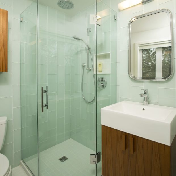
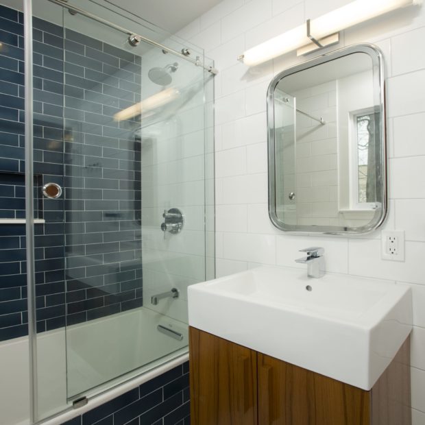
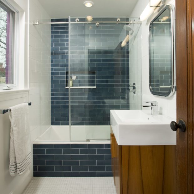
Our clients adore their mid-century home and have outfitted it with iconic pieces, both vintage and reproduction, from the period. Since they wanted their new kitchen and bath renovations to bolster this style, we went with solid teak wood cabinets throughout all three spaces. A sculptural wall capping the island end was inspired by the slatted 1946 Nelson bench. Our custom carpentry team constructed this piece in solid teak to match the cabinetry. The slats were set at a diagonal to feed light from the new, full glass back door into the living and dining areas. Solid wood, geometric grab bar handles were designed in-house and also custom built in our workshop to give another nod to mid-century modern design. As for the baths, the master featured two full walls of soft green, glass tiles oriented vertically. The guest bath was accented with a deep blue, hand-glazed tile wall that we carried to the tub front. Each colored tile was paired with clean, white porcelain fixtures and small format, white tile flooring. Floating teak vanities and storage cabinets were complimented with modern chrome accessories and a vintage-inspired medicine cabinet to help bridge the vogue aesthetics from 65-years-ago to today.
Construction and Final Product
We ran the project in two phases with the homeowners living in their house throughout construction. We began with the master bathroom, which was already partially sacrificed with some plumbing issues. Shortly after completion of this bath, we dove into design for the second bath and kitchen. The clients were so thrilled with the custom cabinetry and fixtures we had used in their master bath that we used many of the same items in the guest bath as well. The kitchen and dining rooms were fully gutted. We removed the tile from the old kitchen and replaced it by extending the oak flooring from the dining room into the new kitchen — again, helping to create continuity between the dining and kitchen areas. We created a bump out to conceal a drain pipe from the 2nd floor, which was previously positioned within the old cabinetry. HVAC ducting was reworked to open the ceiling and provide ample air to the, now larger, room. The cabinetry installation was trickier than most, but our carpenter, Michael, managed to align all the upper and lower elements flawlessly. Electrically, the homeowners made a special request for smart switches to be installed, which would allow them to control their lights online or with their smart phones. After a full floor refinish and a fresh coat of paint, the project was complete.
What the Customer Said
“We were so excited for everything to be completed. Kristin is a miracle worker helping us figure out our likes and dislikes. She turned a dozen or so pictures on Houzz into exactly what we wanted! I walk through the new kitchen and I still can’t believe how she captured our random visions so perfectly.”
