One of the distinct advantages of the design/build model is that most, if not all of your design is done in-house. This means that projects are designed with the end goal in mind: a beautiful space that is both buildable and functional. It’s easy to design something that is functional in theory and extravagant on paper but ultimately, is impractical and impossible to build. In residential remodeling it is particularly important to bear the end goal in mind when designing kitchens and bathrooms, as these areas lend themselves to creative expression and unique design. At Four Brothers, LLC, we are fortunate to have designers that possess hands-on remodeling experience. Throughout all of our projects, constructability and functionality are taken into account as the design is being developed.
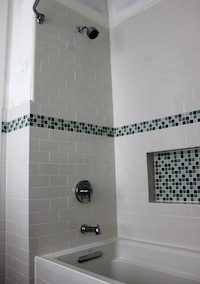
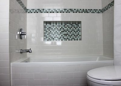
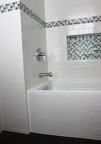
For the project at 753, our client asked our design team to come up with bathrooms that possessed a “wow factor” (her words), while remaining practical and within her budget. Since she has an affinity for the traditional 3×6” subway tile used in period baths we opted to pursue this theme in the guest bathroom. Traditional subway tile as used in the early 20th century differs from most subway tile sold today in chain stores such as Lowes and Home Depot. It was made thicker, and the edges were crisp as opposed to the pillowed edges of most subway tile produced today. Additionally, the tile was set in a substantial mortar bed, giving the tiled portion of the wall an even thicker look.
There are companies that reproduce traditional subway tiles (in many finishes) which we have used in other bathroom remodels. At 753 however, using such tile was not an option due to cost constraints. Therefore, our designers came up with a plan by which we could achieve the traditional look while using the less expensive pillowed edged subway tile by padding out the wall an extra ¼” with a second layer of backer board. This gave the wall tile the traditional “thick” look. For the edges, we ordered a special quarter-trim cap (which concealed the extra layer of backer board) as opposed to bull-nose tile which is typically used.
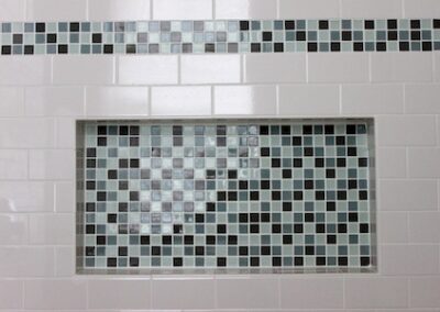
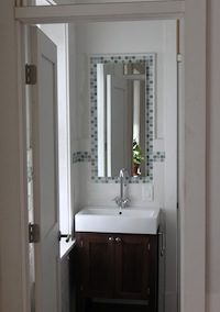
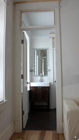
To add some pizzazz, we included a strip of glass mosaic tile throughout the bathroom, around the floating mirror, and in the back of the wall storage niche. For the floor, we opted for a large format darker tile which complimented the white subway tile and darker vanity nicely.
